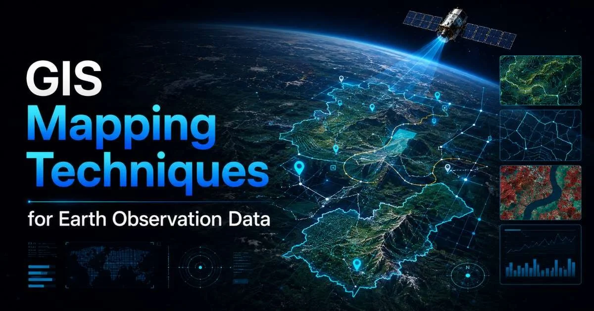
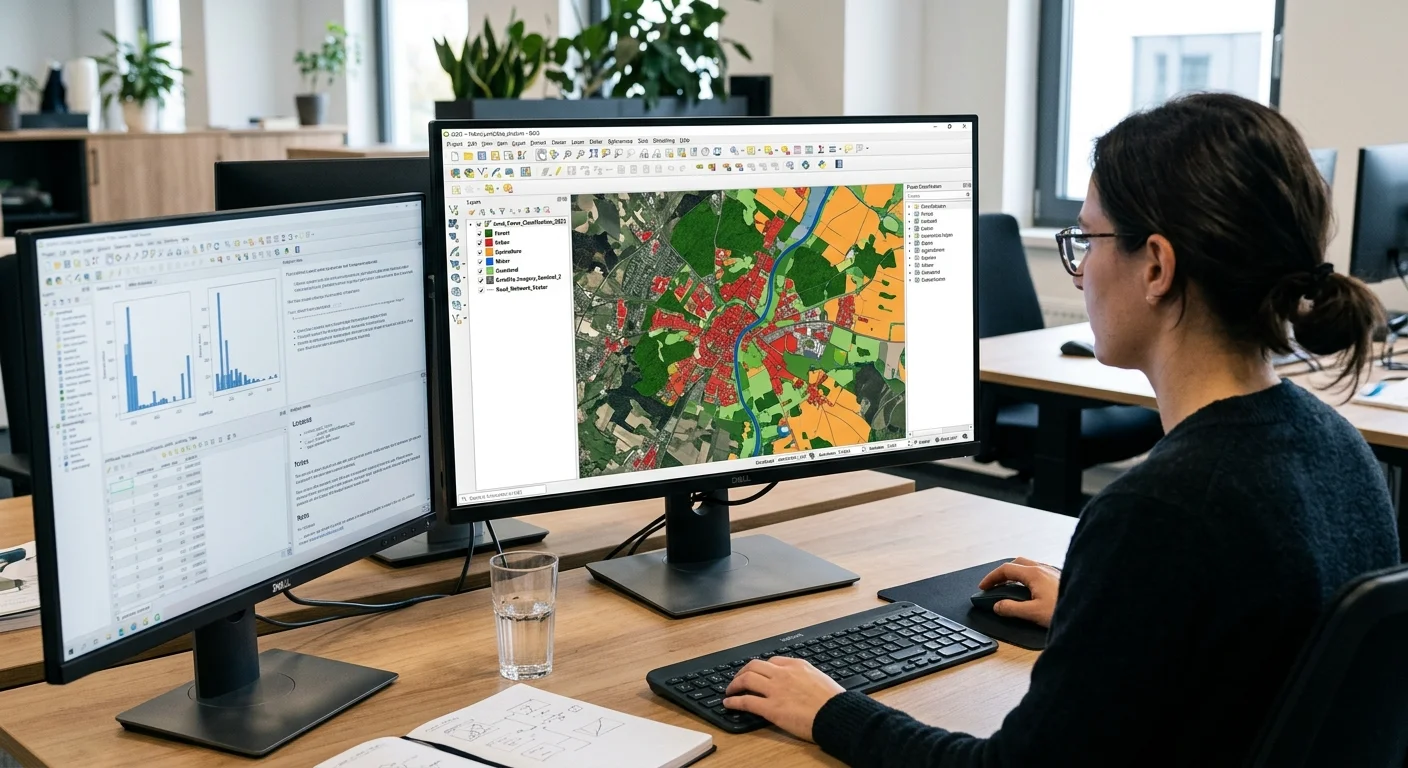
GIS mapping techniques for earth observation data have become foundational tools for analysts and researchers who need to extract actionable intelligence from satellite imagery. Whether you're monitoring urban sprawl, tracking deforestation, or assessing agricultural health, the way you process and visualize geospatial data determines the quality of your findings.
The stakes are real: poor technique choices lead to misclassified land cover, missed environmental changes, and flawed policy recommendations. This guide walks you through four practical steps to build a robust GIS workflow for earth observation data. Each step reflects methods used by working professionals, not theoretical abstractions.
If you're new to the broader discipline, our comprehensive guide on satellite image analysis provides essential background. By the end of this article, you'll have a clear, repeatable process for turning raw satellite feeds into meaningful maps and spatial insights.
Key Takeaways
- Choose satellite data sources based on your project's spatial and temporal resolution requirements.
- Preprocessing steps like atmospheric correction directly affect classification accuracy downstream.
- Supervised classification with ground truth data outperforms unsupervised methods for most land cover projects.
- Vector overlays and spatial queries transform static images into decision-ready analytical products.
- Automating repetitive GIS tasks with Python scripts saves significant time on multi-temporal studies.
Step 1: Select and Acquire Earth Observation Data
Matching Resolution to Project Needs
Your data source selection shapes every downstream decision. Landsat 8/9 imagery offers 30-meter multispectral resolution with a 16-day revisit cycle, making it ideal for regional land cover mapping. Sentinel-2, operated by ESA, provides 10-meter resolution at a 5-day revisit, which better serves agriculture monitoring and smaller-scale pattern detection. For urban analysis or infrastructure inspection, commercial providers like Maxar deliver sub-meter imagery, though at significant cost.
Think carefully about temporal requirements before downloading anything. A single-date image works for baseline mapping, but environmental monitoring demands multi-temporal stacks. If you're studying seasonal vegetation cycles, you need cloud-free acquisitions across spring, summer, and fall at minimum. Projects that track rapid changes, such as flood extents or wildfire progression, may require synthetic aperture radar (SAR) data from Sentinel-1, which penetrates cloud cover entirely.
Accessing Free and Commercial Archives
USGS EarthExplorer and the Copernicus Open Access Hub remain the primary portals for free satellite data. Google Earth Engine provides cloud-based access to petabytes of archived imagery, eliminating local storage concerns. For commercial data, platforms like Planet Labs offer daily global coverage at 3 to 5 meter resolution. The table below compares key data sources to help you match sensors to project needs.
| Sensor/Platform | Spatial Resolution | Revisit Period | Cost | Best Use Case |
|---|---|---|---|---|
| Landsat 8/9 | 30 m (multispectral) | 16 days | Free | Regional land cover |
| Sentinel-2 | 10 m (multispectral) | 5 days | Free | Agriculture, vegetation |
| Sentinel-1 | 5 x 20 m (SAR) | 6 days | Free | Flood, all-weather mapping |
| Planet (Dove) | 3 to 5 m | Daily | Commercial | Rapid monitoring |
| Maxar (WorldView) | 0.3 m | Variable | Commercial | Urban, infrastructure |
Always check cloud cover percentages before downloading optical imagery; anything above 20% will likely cause classification problems in your study area.
Step 2: Preprocess Satellite Imagery for GIS Integration
Radiometric and Atmospheric Corrections
Raw satellite data contains sensor artifacts and atmospheric interference that distort true surface reflectance values. Radiometric calibration converts digital numbers to at-sensor radiance, while atmospheric correction (using algorithms like DOS1, FLAASH, or Sen2Cor for Sentinel-2) strips out scattering and absorption effects. Skipping this step introduces systematic errors into every analysis that follows. When comparing images from different dates, consistent atmospheric correction is non-negotiable.
Never run classification on uncorrected imagery. Atmospheric haze alone can shift NDVI values by 0.1 to 0.15, enough to misclassify vegetation classes entirely.
Remote sensing analysts often underestimate the impact of topographic correction in mountainous terrain. Slopes facing away from the sun appear darker regardless of actual land cover, creating false shadows that confuse classifiers. The C-correction or Minnaert methods adjust reflectance based on slope and aspect from a digital elevation model. This extra step adds 15 to 20 minutes of processing per scene but dramatically improves accuracy in rugged landscapes.
Georeferencing and Mosaicking
Accurate georeferencing aligns your raster data to a coordinate reference system so it integrates properly with vector datasets, GPS points, and other map layers. Most modern satellite products arrive orthorectified, but older archives or aerial photography may need manual ground control points. Use at least 10 well-distributed GCPs and aim for an RMS error below one pixel. Once individual scenes are properly registered, mosaic them with feathering or histogram matching to minimize seam lines across adjacent tiles.
Consider your output projection carefully. UTM zones work well for local and regional studies, but continental analyses may require equal-area projections like Albers. Reprojecting rasters after classification introduces resampling artifacts, so it's better to set your target projection before any analytical work. When managing large datasets, pay attention to file formats. GeoTIFF with internal tiling and compression (LZW or DEFLATE) keeps file sizes manageable without sacrificing data integrity. Handling large volumes of processed outputs also raises questions about data privacy when AI tools are involved in your pipeline.
Step 3: Apply Classification and Pattern Detection Methods
Supervised vs. Unsupervised Classification
This step is where GIS mapping techniques for earth observation data produce their most visible results. Supervised classification requires training samples, manually digitized polygons that represent each land cover class. Algorithms like Random Forest, Support Vector Machine (SVM), and Maximum Likelihood use these samples to assign every pixel to a class. Random Forest typically performs best for heterogeneous landscapes because it handles non-linear spectral relationships and resists overfitting through ensemble averaging.
Unsupervised methods like ISODATA or K-Means cluster pixels based on spectral similarity without prior knowledge. They're useful for initial exploration when you don't know what classes exist in your study area. However, clusters don't correspond directly to meaningful categories. You still need to interpret and label them manually afterward. For most professional mapping projects, a supervised approach with field-validated training data produces the most reliable output.
"The classifier is only as good as your training data. Spend 60% of your project time on sample collection and validation."
Change Detection Across Time Series
Change detection compares classified maps or spectral indices across multiple dates to identify where and how the landscape has shifted. Post-classification comparison is the simplest method: classify two images independently, then compute a difference matrix. Image differencing using spectral indices (NDVI, NDWI, NDBI) offers a faster alternative that highlights magnitude of change without full classification. For complex studies, object-based image analysis (OBIA) segments the image into meaningful regions before comparing temporal states.
Multi-temporal analysis reveals land use patterns that single-date snapshots miss entirely. A forest clearance event followed by regrowth looks different from permanent conversion to agriculture. Time series tools in Google Earth Engine or QGIS Temporal Controller let you animate changes and identify trends across decades of archived data. When organizing results from large time-series datasets, structuring your output reports with clear pagination best practices helps stakeholders navigate complex findings efficiently.
Change detection accuracy depends heavily on consistent preprocessing. Use the same atmospheric correction algorithm and sensor for all dates in your time series.
Step 4: Build Analytical Map Products and Spatial Queries
Thematic Mapping and Cartographic Output
Classification results become decision-ready products when you overlay them with vector data and run spatial queries. Combine your classified raster with administrative boundaries, road networks, protected areas, or watershed delineations to answer specific questions. How much forest was lost within a particular district? What percentage of agricultural land falls within a flood risk zone? These are the questions that transform GIS mapping techniques for earth observation data from academic exercises into tools that inform real decisions.
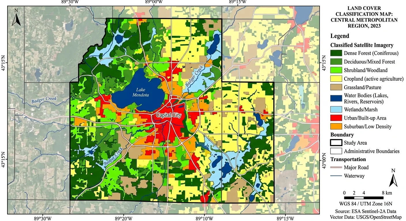
Cartographic design matters more than many analysts admit. A well-designed thematic map uses intuitive color ramps (green for vegetation, blue for water), includes a proper legend, scale bar, north arrow, and projection metadata. Export maps at 300 DPI minimum for print reports. For web distribution, consider GeoJSON or vector tiles that allow interactive exploration. Your map is often the primary deliverable that non-technical stakeholders see, so invest time in making it readable and accurate.
Automating Workflows for Repeat Analysis
Repetitive mapping projects benefit enormously from automation. Python libraries like Rasterio, GeoPandas, and scikit-learn handle raster I/O, vector operations, and machine learning classification respectively. A well-structured script can download imagery, apply atmospheric corrections, run classification, compute accuracy metrics, and export final maps in a single execution. QGIS also supports graphical model building through its Processing Toolbox, which lets you chain tools without writing code.
For operational monitoring systems, schedule automated runs using cron jobs or cloud-based triggers. Google Earth Engine's JavaScript and Python APIs enable server-side processing that eliminates local hardware constraints. The investment in automation pays off quickly: a workflow that takes four hours manually can execute in minutes once scripted. GIS mapping techniques for earth observation data become truly powerful when they run at scale, processing hundreds of scenes across years of archived imagery without manual intervention.
Version-control your processing scripts with Git. When classification parameters change or new training data arrives, you'll want to trace exactly what produced each output map.
Frequently Asked Questions
?How do I run atmospheric correction before classifying Sentinel-2 data?
?When should I choose Sentinel-1 SAR over Sentinel-2 multispectral imagery?
?How long does building a multi-temporal GIS workflow typically take?
?Does unsupervised classification ever outperform supervised methods for land cover?
Final Thoughts
Mastering GIS mapping techniques for earth observation data requires methodical attention to each stage of the workflow, from sensor selection through final map production. No single tool or algorithm solves every problem; the best analysts match methods to specific project requirements and validate rigorously.
Automation and reproducibility should be priorities from the start, not afterthoughts. Build your workflows with clear documentation, consistent preprocessing, and validated training data, and your spatial analysis products will stand up to scrutiny from both technical reviewers and decision-makers who depend on them.
Disclaimer: Portions of this content may have been generated using AI tools to enhance clarity and brevity. While reviewed by a human, independent verification is encouraged.